One of the first significant projects at John M. Corcoran & Co. involved building a new corporate website featuring the latest branding and verbiage to convey our new brand identity, encapsulated by the slogan ‘Building Community’. The project began with an assessment of the existing website, built on an outdated CMS that offered limited customization beyond the standard WYSIWYG editor.

We evaluated several developers and selected one distinct from those used for most of our property websites. This decision aimed to simplify any future transitions to different property management systems.
During this period, the company underwent a rebranding, and the existing site was revamped to align with this change. It became apparent that our online B2B information was scattered, hindering the discovery of relevant service details and negatively impacting how Google indexed these pages, leading to lower landing page visits. The rebranding merged the management and development aspects of our business, necessitating a comprehensive, guided user experience, a feature the then-current homepage lacked.

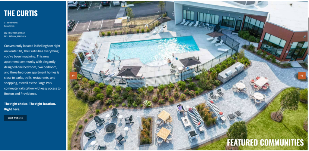
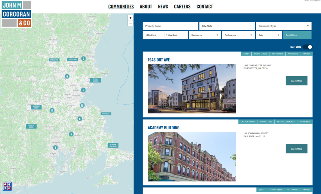
To foster engagement and effectively represent both sides of the company, development, and property management, we introduced a dynamic section that revealed detailed information about both aspects. This section was complemented by a filtering search tool, enabling prospects to sort apartments by location and size. Additionally, recognizing the need to feature multiple communities simultaneously, we enhanced the website to display several properties at once, thereby increasing backlinks to individual community websites.

The new feature displaying pricing on the communities page significantly improved traffic quality to the properties, as pricing is often the first disqualifier for many mid-funnel users.

Communities | Apartments & Affordable Housing in Massachusetts
On the Communities Page, the challenge of overlapping pins for closely situated properties was resolved by grouping them and displaying the number of properties in each area. This adjustment streamlined the UI, enhancing usability compared to the previous version.
Like most websites, deeper exploration typically indicates higher user intent. However, this can be counterproductive if deeper pages remain unseen. I aimed to simplify, optimize, consolidate, and enhance the user journey. This approach effectively doubled the click-through rate for pages on Google and increased user engagement time by 40%, demonstrating the project’s success in enhancing the website’s effectiveness and user experience.
The success of this project not only bolstered our online presence but also set a precedent for future digital initiatives, underlining the importance of user-centric design and strategic content placement in driving digital engagement and building a cohesive online community.

